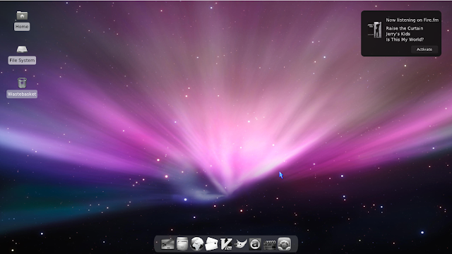
Typically these included themes look sort of old-fashioned, with square buttons and sharp edges. So on the odd occasion where I downloaded a new theme at I thought nothing of it looking the same and not achieving the smooth look promised in the screenshots, often taken in Gnome, and just took it as a limitation of Xfce.
 Until recently, when I ran the Appearance switcher with a terminal open and noticed several warning messages about engines not present. A real 'Duh' moment. If you're running a distribution that is ready built around Xfce you probably have all these already on board, but I fired up sbopkg and quickly compiled and installed gtk-engines (which provides the Clearlooks, Crux, Glide, Industrial, LUA, Mist, Redmond, and ThinIce themes) and the murrine engine. Wow, what a difference, the axiom theme looks round and smooth suddenly. Or how about Gentle_2.0 if you like it grey and subdued?
 |
| Axiom theme with Noir Crystal icons, Crystalcursors, Tint2 panel, Gkrellm |
 |
| Axiom window borders, Wbar, top panel auto-hiding |
 |
| 'Mintified' desktop with Minty-Fresh icons, Mint-X-Metal-Dark theme, Gkrellm invisible theme, notifications set to 70% opacity |
 |
| The Xubuntu look on your distro of choice |
Icons here, Xubuntustudio-MOD theme and Xubuntustudio window decorations (Xfwm theme). Or try the Shimmerproject Greybird and Bluebird themes for something a little lighter.
 |
| Shimmerproject Greybird, showcasing slider and scrollbar |
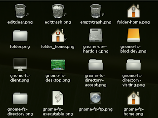
In any case, a nice set of icons is often all it needs if you just want to get productive with minimum effort.
 |
| Axiom theme with Axiom Dark borders, Noir Crystal icons, Wbar + Gkrellm |
Another icon theme if you want to achieve the Mac look is OSX_Aluminium.
The Faenza icon theme also works very well under Xfce and even has an extension pack available, aptly named Faenza-Xfce, that covers the icons specific to this desktop environment and is thus a neat theme that does not leave any blind spots.
Another one of my faves which I only recently discovered is DarkGlass, but it is intended for KDE 3. I'm sure though it can be extracted and made to work with Xfce as well but I haven't had time to look at the setup script yet which apparently is for KDE only. If you get there before me please let me know how you accomplished it.
Wbar is certainly a nice addition. It is not as intricate as AWN or Cairo-dock but has little if any additional dependencies, looks good and is easily installed or compiled. It has several backgrounds to choose from and also offers transparency.
Hope I gave you some suggestions how to make this little desktop environment look gorgeous, and with all the people out there looking for alternatives to Unity and Gnome Shell I'm hoping you consider Xfce. It's not nearly as limited in possibilities or as ugly as you might think. Happy tweaking! Please leave any of your own suggestions, themes you're fond of, questions, in the comments below. And another screenshot before we go.
 |
| Gnome Carbonate icons on the desktop, Wbar Noir Crystal, notification opacity 90% |
Edit: Added a 'Minitified' screenshot.


No comments:
Post a Comment
Please leave your comment here. Spam will be deleted.
Note: only a member of this blog may post a comment.