Companies and projects have been thinking and researching ergonomics in software development pretty much since the beginning, even if that was just a developer thinking about where best to place this or that button in his program.
The GNOME project had the Usability Project from 2001 to 2011 and now apparently has design teams to cover usability. GNOME also came up with the HIG - the Human Interface Guidelines. So you would think the GNOME world is well prepared in terms of software ergonomics as far as human to interface interactions go.
Unfortunately the GTK+/GNOME using world in reality seems to have paid little heed to usabiliy studies as of late, just as much as the hodgepodge of applications written for the different desktop environments using the toolkit, with all their various takes on window borders, size, button placement and size etc. and custom applications for the various distributions and projects does not help.
KDE on the other hand has never had this problem and presents a well integrated desktop experience, even when using Qt applications not explicitly written for being part of the KDE suite. It even has a settings module to integrate GTK applications into the overall look as much as possible. This works quite well but perhaps apart from Firefox and LibreOffice most KDE users seem to prefer a as pure as possible desktop experience.
This, with all the mix in styles going on from the various projects, leaves the GTK using group at a disadvantage. Even a project like Linux Mint, who put some thought and effort into presenting a nicely integrated desktop that behaves in a more or less unified manner, still does not fully achieve this. The welcome screen uses a thicker GNOME-application style Adwaita border that does not respect the rest of the Cinnamon theming, neither in size of the window border nor color. In general GNOME and Cinnamon do not mix well as GNOME applications will always keep their own borders. Then there's the issue of placement of window controls and search fields which differ from desktop to desktop and sometimes from application to application within the same desktop environment. Not to speak of GTK applications like MPV or Celluloid, apparently hard coded to use a dark theme and an expanded set of window controls, browsers and other third party software. Synaptic too looks out of place, falling back on a basic GTK2.
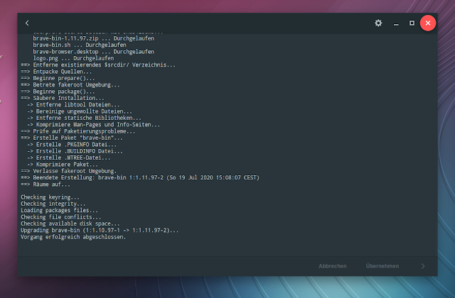
Even worse when using a not as carefully collated distribution where you are creating your own, like with Artix for example. I've used the Cinnamon spin alright and it looks very nice with a bit of theming and additional icons until you install more graphical programs. Adding Pamac for instance will land you a massive border and window buttons almost twice the size, which really looks out of place next to any open Cinnamon windows. Then in compile mode, in true GNOME fashion that is trying to cram everything into the window border in its pursuit of distractionless computing, we get a cog wheel for settings to the left.
 |
| AUR mode in Pamac - oversized border and close button. |
Every other desktop and file manager, including its immediate predecessor, has the search function either in the menu bar or on the right. This is what desktop Linux has come to - an apparent need to differentiate and confuse users by arbitrary, and often changing, placements of buttons and functionality in applications instead of standardization and ease of use, each of the major desktop environments doing 'their own thing'.
 |
| Pamac window controls, stack and search function. Note the backgrounded Cinnamon terminal and border size. |
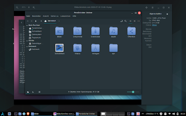
On top of that it differs from application to application. Here's the GNOME picture viewer in all its glory with a very crowded border and in contrast a more traditional Nemo file manager in the fore. Mix well they do not. Better get rid of the default and install something from Xfce or Mate.
 |
| Busy picture viewer border contrasting traditional Cinnamon file manager |
Most if not all of these complaints are actually about how unconventional the GNOME 3 desktop and its applications are designed and how they do not blend in with others which may seem unfair to avid fans. However, some like MPV and Celluloid are GTK application frontends independent from it. And as all these are quite freely, and liberally, used in all sorts of distributions and desktop environments with a mix and match attitude and I think the GNOME and other developers are quite aware of that it would be nice if their design was more compatible and respect the overall theming and ergonomics of other environments when running under those. This may be hard to do if all functionality is crammed into a window border but perhaps a compatibiliy mode could be introduced. The only other way would be to avoid everything related to this desktop and if this is not possible the whole toolkit.
A quote from the GNOME Usability pages:
“One of usability’s most hard-earned lessons is that ‘you are not the user.’ If you work on a development project, you’re atypical by definition. Design to optimize the user experience for outsiders, not insiders."
Jacob Nielsen
More programmers and interface designers today should take heed of this hard won understanding.
Edit: Found this about MPV ending GNOME support.

"The only other way would be to avoid everything related to this desktop and if this is not possible the whole toolkit."
ReplyDeleteI've reached that same conclusion back when the Gnome/GTK3 sabotage has first appeared. I do not have any GTK cruft.
If you do, try the best, the venerable Fluxbox! I don't have any Xfce utils either. I love Xfce, but because of its reliance on unreliable toolkit I would use KDE instead if forced. By the way, mpv is not a GTK (or Qt) app, it's toolkit agnostic.
ReplyDeleteHow is this a critique of Gnome usability? Gnome apps look perfectly fine on Gnome, where CSD is the norm. I feel Gnome's headerbar has serious usability issues such as discoverability, knowing what you can click on, etc. But you address none of these issues, but rather rant about how a Gnome app doesn't look good on a non-Gnome desktop.
ReplyDeletePersonally I hate the HeaderBar and CSD (I disable CSD wherever I can, in Chrome, Firefox, etc), but Cinnamon ships with their own versions of traditional-looking utilities. So this is a non-issue.
Usability and Gnome 3.* are mutually exclusive notions.
ReplyDeleteI have been using Gnome since the 2.x era...and right up into the present. All those who don't like Gnome?..or don't like it's appearance? Well you're free to use what you like, but for me? Gnome "Works" Period. I don't need half the crap mentioned in this article...(which seemed to be nothing more than an a$$ kissing session for KDE!..LoL!) Nah. Gnome is fine the way it is, I like my suspended windows...no System bar at the bottom of my screen, the multiple desktops to the right, and the easy way I can get to it..(one press of the "Windows Button"!) I guess there's something for everyone in the Open Source world. Dunno why the hate towards Gnome tho, there are those of us who think its awesome, and prefer it over Cinnamon, KDE,LXqT, XFCE etc.
ReplyDelete